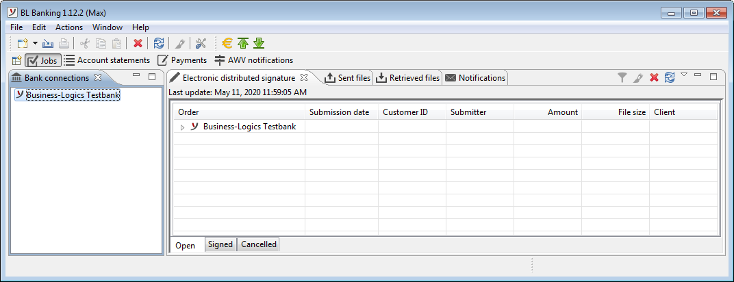
Figure: Application window of BL Banking
BL Banking has a user interface that for the most part allows the program to be operated intuitively. The broad range of software functions can be accessed via the menu, the toolbar, and the context menus. Wizards are available for more elaborate entries. The entire functionality of BL Banking is segmented into topics with the help of so-called perspectives (see section Perspectives).
The application window consists of the menu, the toolbar, and the perspectives, which are in turn segmented into various tabs.
The Title bar of the window always indicates the BL Banking version and the logged in user (in brackets) (see also section Remarks - Application versions).
After starting the program, the date and time of your last login are displayed at the bottom left. For processing operations, a green bar on the right shows the progress, e.g. when retrieving orders in the EDS. For extensive operations, you can click on the icon in the status bar to open a tab with ongoing processes. The same applies to error messages that may occur during operation. Errors are indicated in the status bar by an icon (stack with red cross). Once processing is complete, clicking on the icon opens a dialog box in which you can view a list of errors with details. For EBICS errors, the details contain recommendations for action, which you can read here in the appendix, see EBICS error messages. An error occurs when a WSS connection is terminated, which is necessary to be able to receive real-time notifications with which banks inform about data ready for retrieval. The WSS connection can be restored in the bank properties. If the WSS connection is working, the status bar provides information about real-time notifications that have arrived and can be opened using the button Display. Optionally, you can see how much memory the application is currently using on your computer. You can configure this displays in the Preferences under General information – Window settings and File transfers.
Figure: Application window of BL Banking
The menu consists of a bar along the upper edge of the application window and several multi-level sub-menus that are accessed by mouse-click or hovering. Several menu items can also be accessed with keyboard shortcuts. Certain menu items, e.g. File-New contain various sub-menu items that depend on the selected perspective.
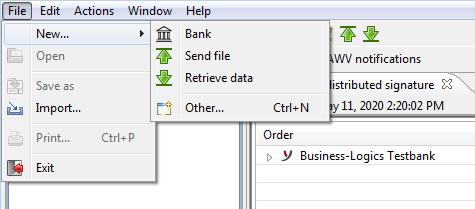
Figure: Menu with sub-menus
The toolbar is located under the menu-bar and serves as a fast access tool for frequently used functions. These can also be accessed via the menu, the context menus, and keyboard shortcuts. Certain buttons and menu items on the toolbar have context-specific features. For instance, the New button and menu have a different list of sub-items depending on the selected perspective.
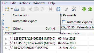
Figure: Toolbar with sub-menu
Some tabs, such as Electronic distributed signature, have additional buttons that are each located along the right edge. In addition, several tabs have a menu that can be displayed by clicking on the arrow in the upper right-hand corner. Instead of an arrow, a symbol with three vertical dots (⋮) is also used.
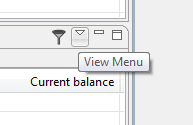
Figure: Menu on the right edge of a tab
All sections within the perspectives can be accessed by right-clicking on the context menu. They contain menu items relevant to the respective topics, which in part can also be accessed via the menu.
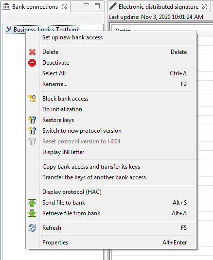
Figure: Context menu
Buttons in the application window and on the toolbar are equipped with tool tips, i.e. a short help text is displayed when the mouse hovers over the buttons without clicking. Other application elements, such as data entry fields, also have tool tips when additional explanations are required.
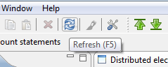
Figure: Tool tip for a button
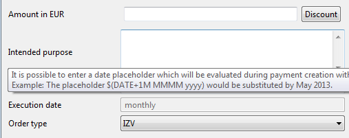
Figure: Tool tip for a data entry field