Figure: Example for a heading
The data of all banking functions are displayed on pages with an overview. These pages are called up from the main menu. Each page has a heading at the top left for orientation. If you click on this, a bar is expanded containing a short description of the page.
Figure: Example for a heading
Below the heading there is a row with buttons, which allow to carry out actions. Then, either a new page is loaded, a dialog box is displayed or the action is executed immediately. The result of the action is usually displayed as a message in a colored bar below the heading. The colors have the following meaning: green — success, blue — information, yellow — warning, red — error.
Some buttons are deactivated and can only be clicked, when one or more rows have been selected by setting the checkbox in the left column. Some buttons contain the number of selected rows that will be affected by the action, others have a small arrow on the right-hand side that opens a menu with options to choose from. Colored buttons indicate a special meaning, e.g. red means Delete, green means Sign, blue means Edit.

Figure: Example of different buttons
Overviews can contain a large number of data entries and fill several pages. In this case, a so-called Pager is displayed on the right above the columns, which is used to scroll through the pages. Click on a number to jump directly to a specific page or on an arrow to scroll forwards or backwards page by page. The pager contains a maximum of eight pages with numbers. If there are more, three dots are displayed as placeholders. Further numbers are displayed after clicking on a number before or after the three dots.

Figure: Example for a pager with open page 3
The number of entries that are displayed on the page and that are available in total is shown above the first column heading: Show … of …. The first number for limiting the entries per page can be selected from a drop-down list or set individually by clicking on Custom value. The number of pages is recalculated accordingly and the pager is adjusted, shown or hidden. The setting is saved for this overview and the logged-in user.
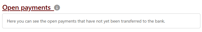
In the leftmost column there are checkboxes, which allow you to mark individual rows for which an action is to be executed. Marking activates buttons above the overview. In some overviews, a blue info bar with the total amount from the selected rows is also displayed. With the checkbox in the header line you can mark all rows and also unmark them again. Other buttons above the overview, e.g. Print, can also be clicked without marking rows. This will execute the action for all rows on all pages. The more rows are available or selected, the longer it takes to execute actions.
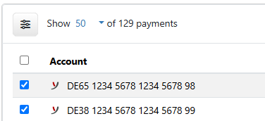
Figure: Example of marking with the number of entries above it
By clicking on a column heading, the overview is sorted by this column. The sort direction is indicated by an arrow to the right of the heading. With another click, the sorting direction is reversed. The settings for sorting are saved individually for each user and are retained even after logging off. In some overviews, there is a button at the top right, which can be used to set back to the default sorting and change the direction with another click.
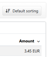
Figure: Example of descending sort order
If several tenants are set up, you can select one of them in many overviews to limit the data to this tenant. There is a button above the overview for this purpose. The tenant selection of an overview is saved and reloaded the next time the overview is opened. The option All tenants displays the data of all available tenants. Only users who are assigned to several tenants see this button.
Figure: Example for a tenant selection
On some pages it is possible to move entries of the overview to folders or groups. This gives you a better overview of the data when there are a large number of entries. There is a button in the bar below the headline that displays the folder currently in use. By clicking on the button, a menu is expanded, which allows you to perform actions related to the folder. In addition, there is an action for moving an entry into a folder. This is located in the menu More actions and is only activated if one or more rows are marked.
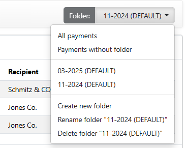
Figure: Example of a folder selection
By clicking on a row in the overview, a new page with a details view is loaded in the most cases, or a dialog box is displayed. For more information on this, see the following sections Detail pages and Dialog boxes.
Overviews adapt to the size of the browser window due to the responsive design of the web application. To ensure a user-friendly display in a smaller browser window, the display of many columns is automatically reduced to a set of predefined columns from a certain point onwards. For a browser window in full size, you can determine the selection and sequence of columns for yourself. Use the button to the left of the number of displayed entries to open the dialog box Column configuration.
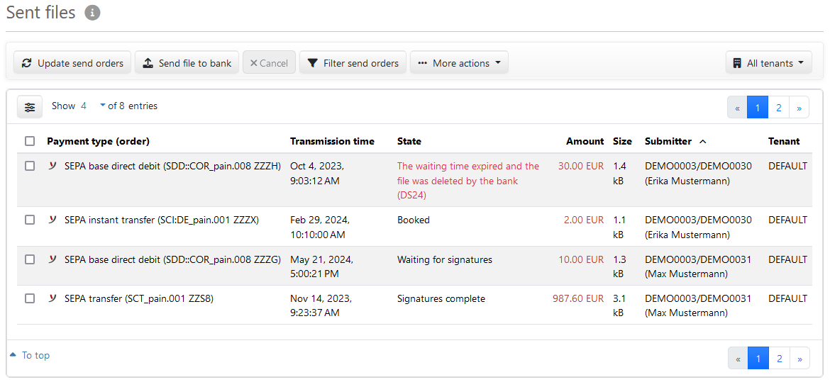
Figure: Example of an overview