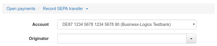
Figure: Navigation path for payments
A detail page appears when you click on a button or a row in an overview. Most detail pages consist of an entry form, others are only for displaying data. The fields are then grayed out to indicated that they are read-only.
For the entry of data, the typical controls are used, such as input fields, buttons, drop-down lists and checkboxes. In the following paragraphs you will find descriptions of further features of the user interface.
Navigation paths, so-called breadcrumbs, are displayed as a text line directly below the page heading. The first element of the path is a link that leads back to the initial page. Changes made on the detail page are not applied, which corresponds to clicking on the cancel button. If an arrow is displayed on the second element, a selection is stored there that can be used to open a different detail page without having to return to the overview, e.g. a different payment type.
Figure: Navigation path for payments
In some overviews, navigation paths can limit or extend the view to certain data, e.g. to the transactions of one account for one year and a certain statement or to all of them. In this case, the navigation path consists of several elements that can be expanded one after the other.
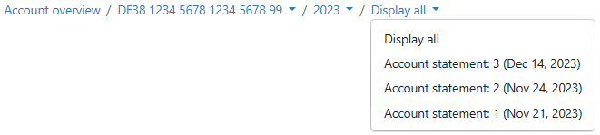
Figure: Navigation path for statements
If given values are available when filling a field, you can select them from a drop-down list or combobox. In case of a combobox, you can also enter a new value. Furthermore, you can find an existing entry by entering a search term. Then the spelling with upper and lower case letters must match the list entries. In addition, there are also input fields with Autocomplete.
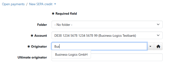
Figure: Drop-down list and combobox
Buttons marked with an arrow expand a menu when you click on them. This is used, for example, when recording a new payment or for the button More actions, which appears in some overviews.
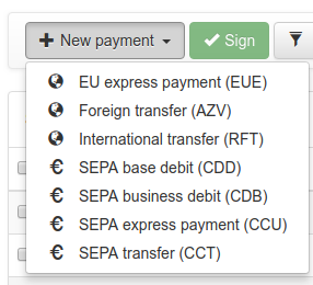
Figure: Button with expandable menu
Many detail pages, especially from settings and payments, are opened in view mode so that fields are not changed unintentionally and actions are not triggered by mistake. To be able to make changes, the edit mode must be activated with the Edit button. This button is located in the top button bar on the left. If you click on the button, it is hidden, input fields can be edited and actions can be executed.
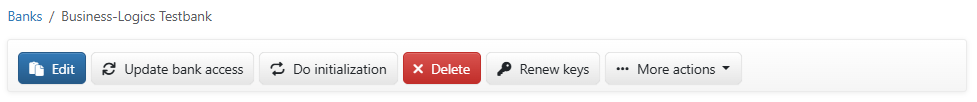
Figure: Button for activating the editing mode (example)
When editing mode is activated, three buttons for processing changes appear below the fields instead of the Back button. The button Submit saves, the button Discard changes undoes the changes. Both buttons close the editing mode and leave the details page open. The button Cancel discards the changes and also closes the detail page.

Figure: Buttons for completing the editing mode
If a file from your computer is required, for example to import it, the button Choose file is used. The name of this button depends on the browser and can also be Browse. A click opens a dialog box provided by the operating system of your computer, e.g. the Explorer for Windows. You can use it to navigate to the desired file and transfer it to the application. On the other hand, if you download files from the application to your computer, they are usually copied to your download directory. Under Windows, this is located in C:\Users\Username\Downloads.
Some input fields have a so-called autocomplete function. As soon as you start typing characters, a list of entries that match your input, opens below the field. Here it is sufficient to write all characters in lower case. If only certain characters are permitted in the field, e.g. numerals, you must observe this.
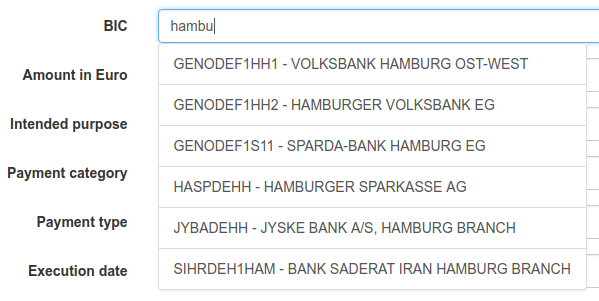
Figure: Autocompletion of a BIC during payment recording
On several detail pages, e.g. Originators, Recipients or SEPA mandates, there is an additional drop-down list at the top, which can be used to select a tenant. This drop-down list is only available if multiple tenants are set up and the logged-in user is assigned to multiple tenants.
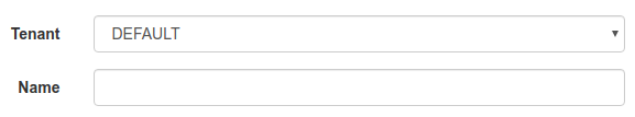
Figure: Drop-down list for tenants